The following outlines some of the tips I've picked up along the way. Implementation is easy and will have a positive impact on any website.
Strong call-to-action
One of the first issues I see is that there isn't a call-to-action (CTA) in the header and hero section. When you first load a webpage, especially on the home page, there should be a business goals-driven CTA. You must though resist using too many different CTAs in this section. Having different CTAs will confuse the user, resulting in them wondering what to do. Often resulting in no action at all.
The actions you wish the user to take will depend on the client's goals. The following are examples to help get you started.
- Book a call.
- Start a free trial.
The above examples are clear and precise without being intrusive. HubSpot also has a great article for further inspiration.
Assertive CTAs
Assertive, as opposed to passive CTAs, tend to drive better results. Passive CTAs would be something like;
- Read more.
- Learn more.
- Contact us.
Whilst the above gives a sign of what the button or link will do, they are non-descriptive. If you know the action you wish visitors to take, then make it clear.
We've implemented this strategy across web design projects and seen great results.

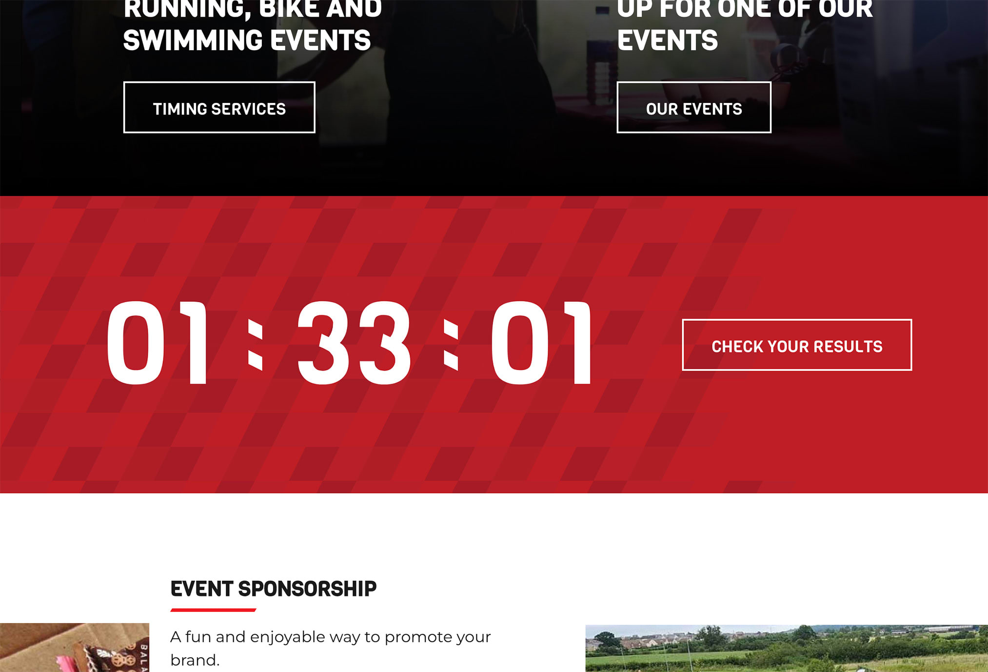
The check your results button leaves nothing to the imagination. It's assertive, and the action is obvious.

The same is true of the Get a Quote button, which is short and very actionable.
Results based heading
This tip can be a little tricky at times, especially if you are not a copywriter. As a website owner, you should avoid making it all about you. The customer wants to know how your service or product will benefit them.
The goal here should be to articulate the client's problem into a heading. I, like many of our customers, am not blessed with copywriting skills. But if you tell your copywriter, this is what you are after. Then I can guarantee they will be able to come up with something.
As for examples – Ahrefs has the header of "Everything you need to rank higher & get more traffic". This example headline tells you what they are offering and the result of using their service.
Our agency gets many enquiries from businesses running WordPress websites. Hence, we decided to add this as a service on our site. Our headline reads, "Streamline your website management with expert WordPress support". Even though I say so myself, this illustrates the point; it answers how we can help with a specific web service.
What / Who / How
It's important to convey what you do, who you do it for, and how. Simple, right? This is one that often gets lost in the web design process.
The content will be very different depending on your business and what you do. The home page is a great place to answer these three basic questions. You can then link to more in-depth information elsewhere on the web site.

Testimonials / Social Proof
I would hope social proof is a pretty obvious tip. But it's essential for potential customers to see proof that you are good at what you do. Testimonials do not need to cover a huge area. For example, carousels work well, or you could load random snippets using PHP.
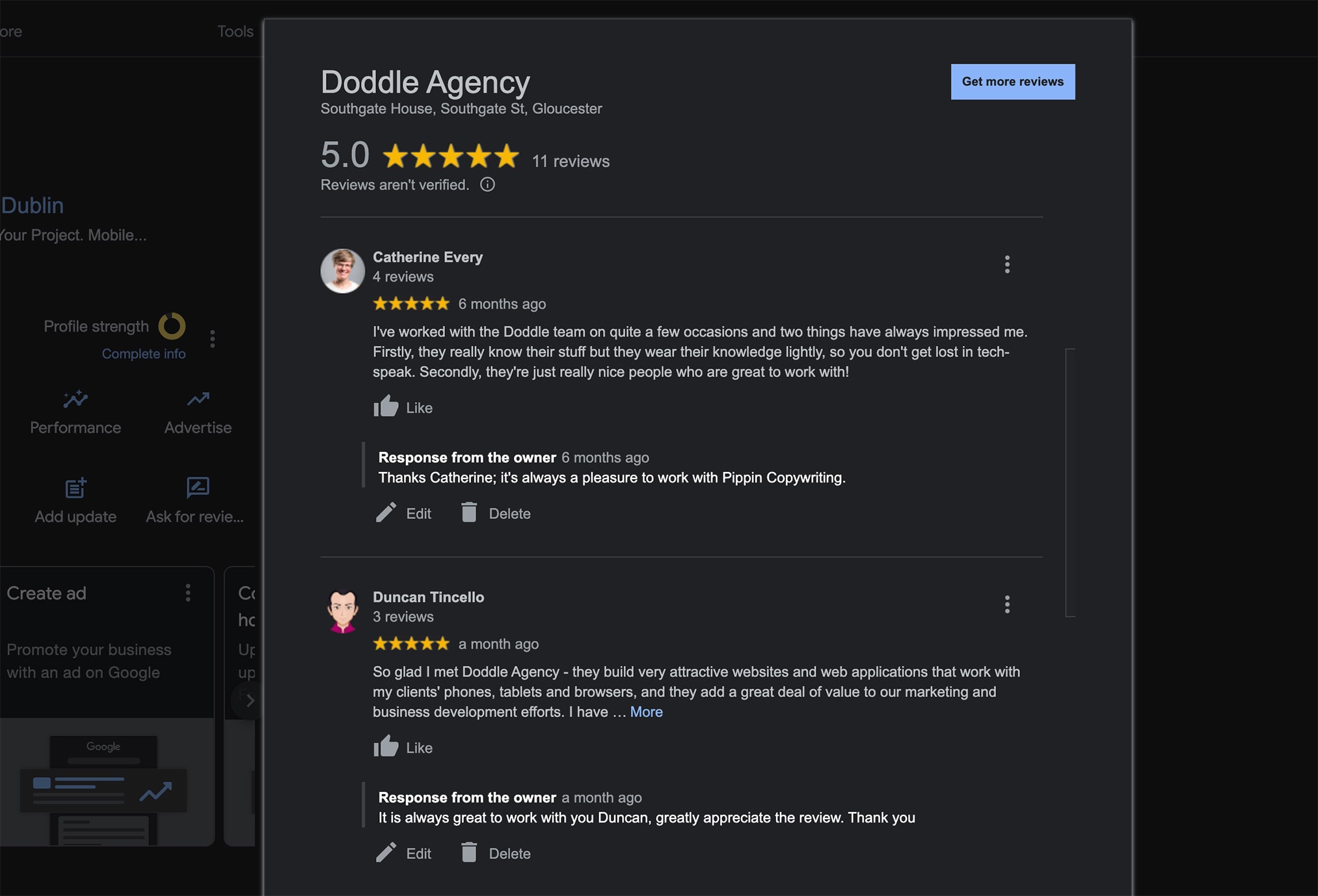
Showing the testimonial comes from a third party adds a lot of trustworthiness. You can do this using services like Google Business Profile, Trustpilot, or Feefo. Seeing the source of the quote shows that the author has taken the time to leave a review. Reinforcing trust in your brand.
Many review services have plugins, making it super simple to share social proof.
Footer call-to-action
This tip is often missed; the site visitor has looked at your page and read some content. They have made it to the bottom of your web page. I would suggest there is quite a high likelihood your content is of interest. Isn't this the perfect time to reinforce your primary call-to-action?
Adding a call-to-action above the footer often results in high click-through rates. By this stage, the visitor knows if your business is a good fit; giving them a CTA is crucial.
Funnel CTAs
Companies that need more than one call-to-action should consider funnel CTAs. A funnel call-to-action guides prospective customers through different stages of a sales funnel. Awareness of decision is an example. Ensuring they are relevant, compelling, and targeted to the user's intent. Funnel CTAs could include:
- The awareness stage includes activities such as downloading a free ebook. Signing up for a newsletter or viewing webinars.
- The consideration stage would be to request a demo, book a consultation or get a free trial.
- The decision-making stage consists of actions such as. Buy now, start your subscription or contact us about XX service today.
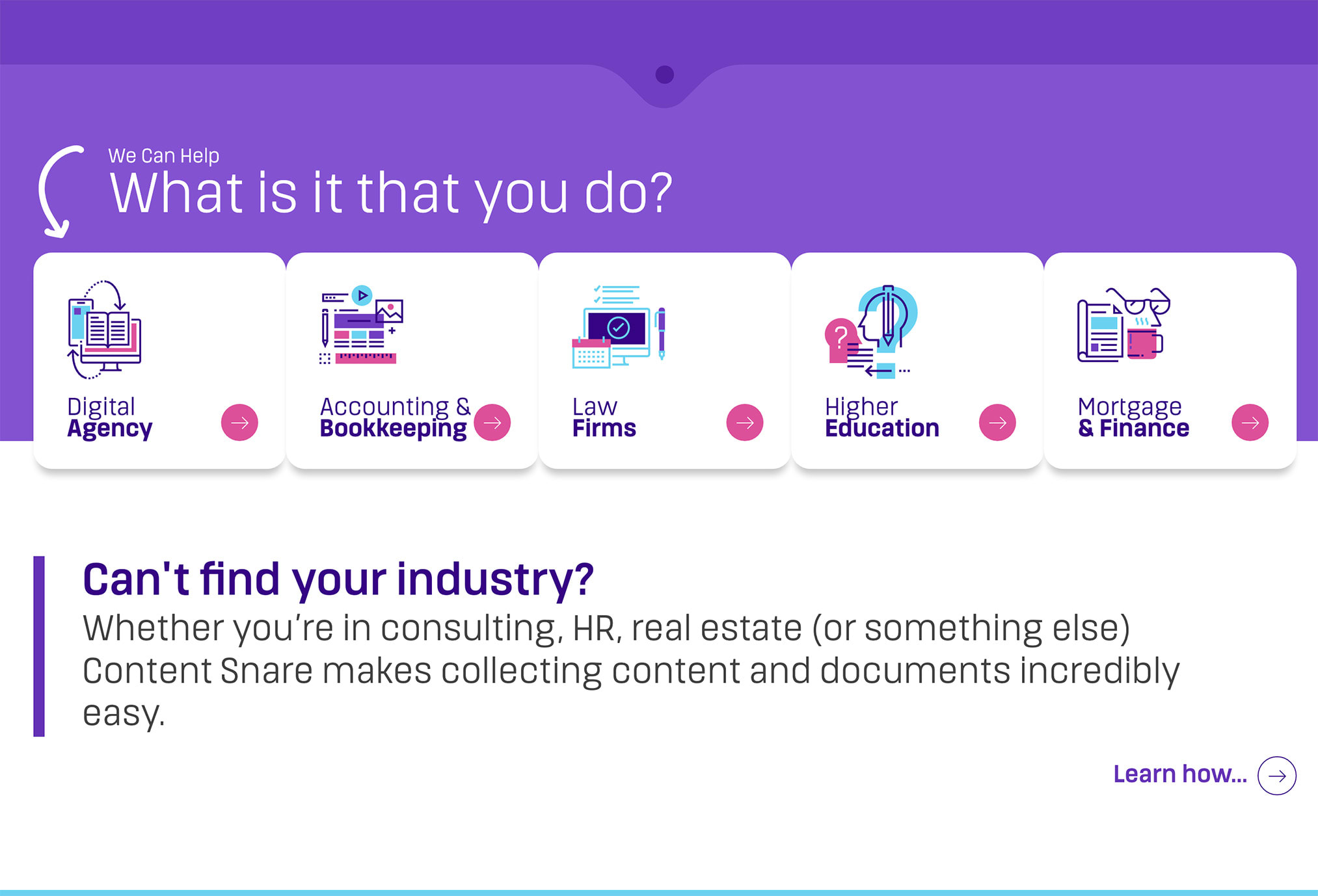
Content Snare has a nice example of this.

Content Snare recognised that their product could be helpful to different industries. The above helps to guide the user to content specific to their sector.
Conclusion
There are many resources around the web for increasing web conversions. These are some of the basic principles we build into our website designs. If your business is looking for ways to increase web conversions Doddle could help. Give us a ring on the number below to start a conversation.
