
The importance of responsive digital designs cannot be understated. When grids are used, a consistent layout can be achieved across a variety of devices with different screen sizes.
Grids offer several benefits
- Consistency and transparency It is through grids that the layout of the interface is governed, and it is through grids that elements are placed consistently. Moreover, a well-designed grid facilitates the scanning of components on the screen, resulting in a positive user experience.
- Creating responsiveness is easier The importance of responsive digital designs cannot be understated. When grids are used, a consistent layout can be achieved across a variety of devices with different screen sizes.
- Design process that is faster Grids provide designers with guidelines for proportions between elements, such as spacing and margins, which speeds up work and reduces errors.
- The ability to collaborate more easily Both designers and developers benefit from UI grids. Work is coherent and more integrated when there is a common layout plan or guidelines for spacing and margins.
Terminology for basic grids
In order to be able to work with the grid effectively, it is important to understand the terminology of its elements, as well as what they do and how they may be used.

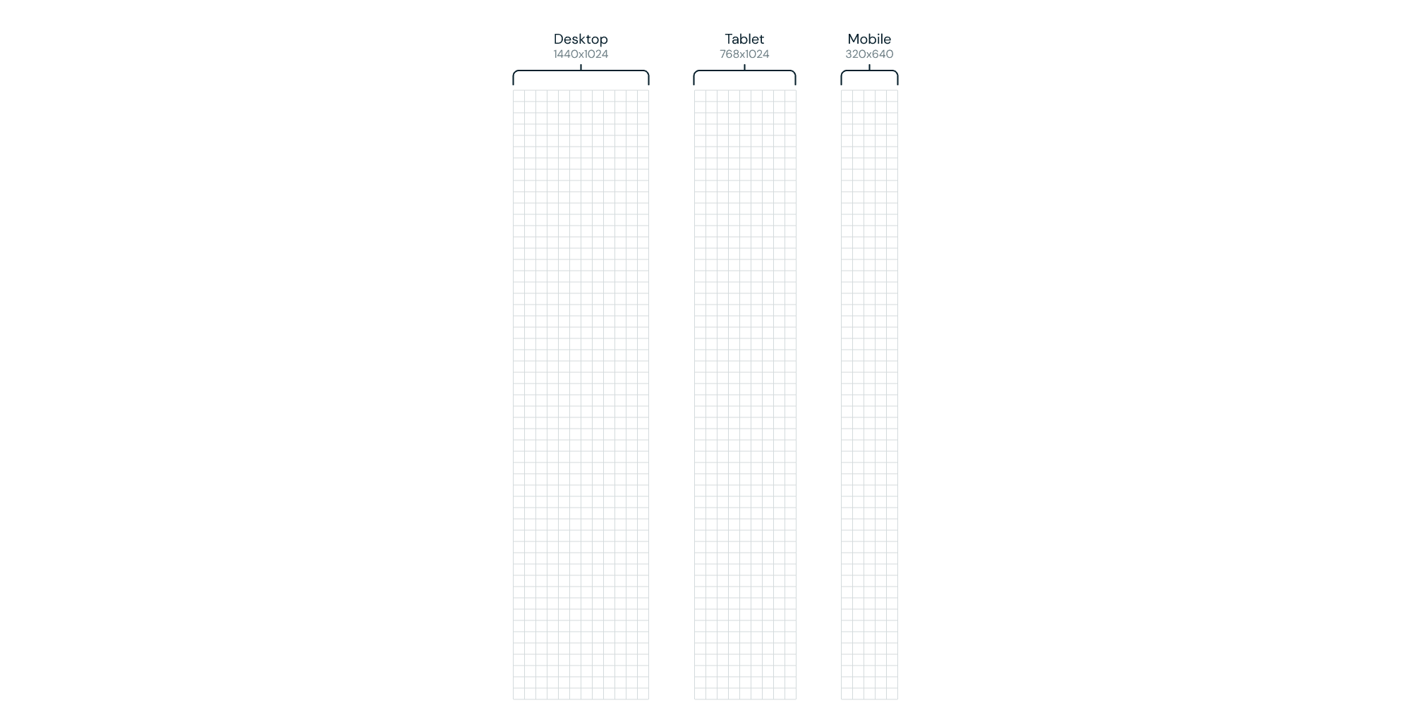
Typical device dimensions
Check the screen of the device for which you are creating the project to determine if there are any limitations. The three most popular screen resolutions are shown below.
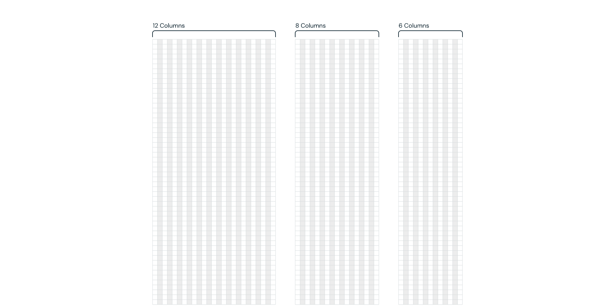
Amount of columns
The number of columns in the grid structure depends on the needs and the nature of the project. Below you will find types of grids for various devices if you wish to use the most popular grid structures.
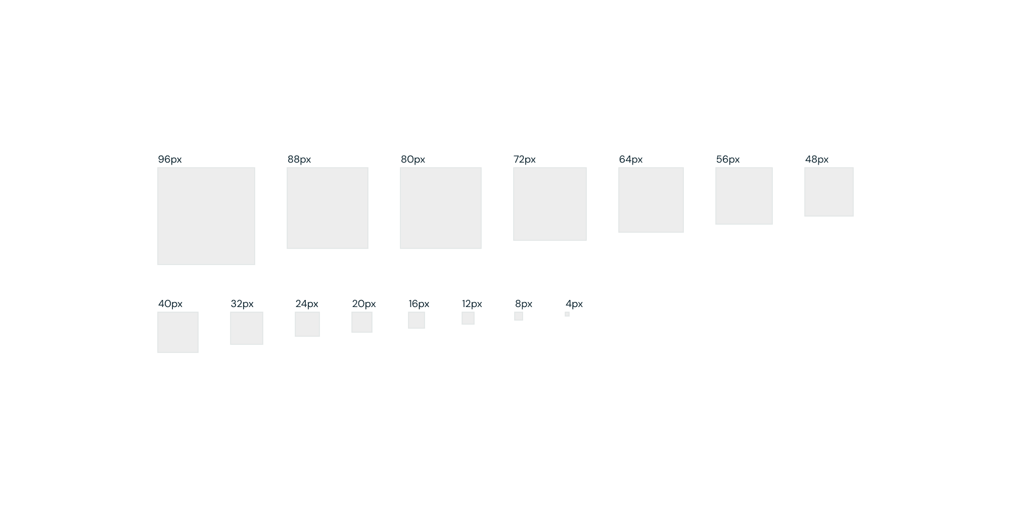
4px grid system
Grid structures and interface elements that are built to a specific scale are easier to scale and bring order to the design. Most commonly used grid systems are 8 pixels or 4 pixels (4 pixels give us more flexibility when designing).
The difference between a soft and a hard grid
In designing, we can use the standard grid, which consists only of vertical columns, or we can use a more advanced grid by adding baselines, which facilitates the arrangement of the content in the project and ensures consistency across all elements.
By creating a grid in your digital designs, you will not only increase consistency in your projects, but you will also enhance your brand recognition. Further, the designs will flow into production in a much more realistic manner, ensuring that the website or application your customers see in the design phase is delivered after development.