
Incorporating accessibility, user experience (UX), and responsiveness will create a more enjoyable and positive digital experience for users. Websites considering these disciplines from the project's inception will provide users with much more value in addition to standing out from the competition.
Hoverable iconography
Modern web interfaces should strive to provide intuitive and accessible user interfaces. There are, however, some design elements that often create barriers to accessibility, such as iconography.
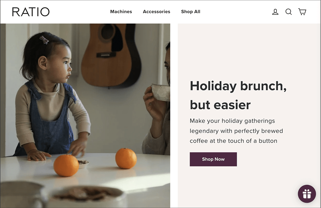
It is not uncommon for certain icons to have universal interpretations, such as those found in website headers. As an example, Ratio Coffee uses three icons on the right to serve a specific purpose and are easily understood by most users. Nevertheless, it is important to consider alternative design elements that can ensure accessibility for all users in case some icons are confusing or unclear.
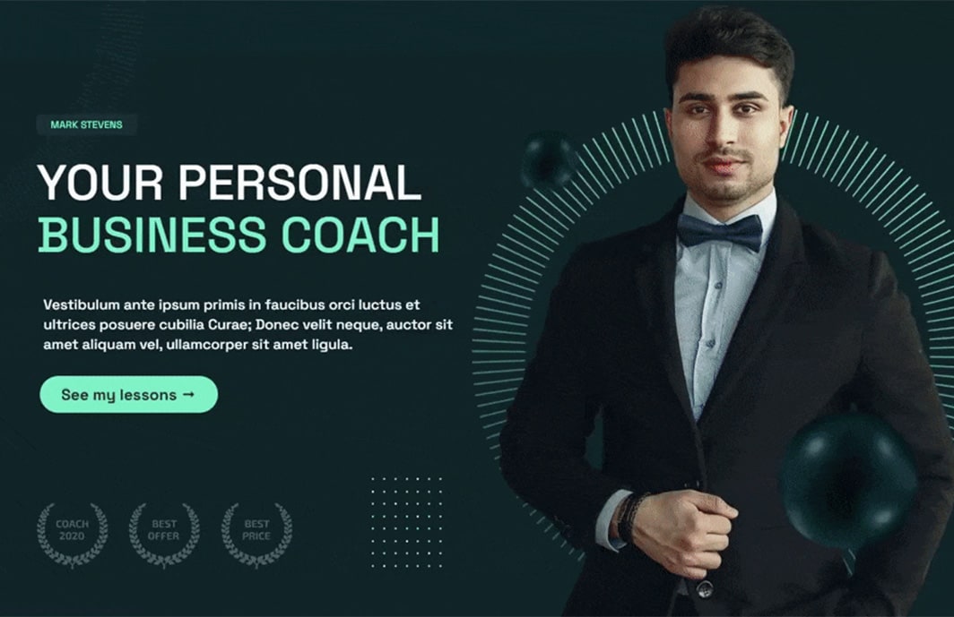
Consider how users may interpret certain design elements differently based on their cultural backgrounds. A trend that is expected to emerge in 2023 is the use of hover-triggered helper text to provide additional context and clarification for icons that are not universally understood.
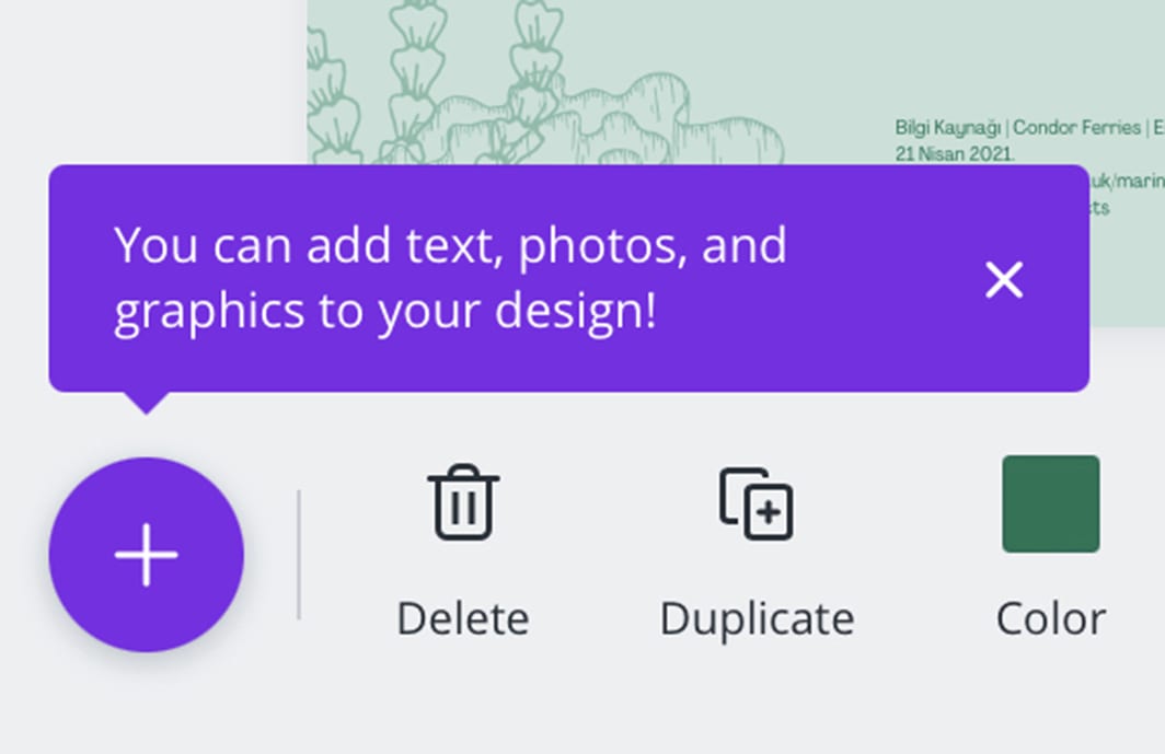
In the above example, hovering over the plus icon reveals helpful text to guide the user. As a result, the website's content can be easily accessed by all users. Implementing similar design patterns to enhance user experience could help businesses achieve better click-through rates or sales, as examples.
More social proof
The building of trust is an integral part of any relationship, whether it be a personal or professional one.
Websites are often the first point of contact between consumers and brands, so trust must also be built there. Social proof and trust markers to accomplish this goal will become essential.
Websites can use these trust builders in a variety of ways. There are several ways to do this, one of which is to include a page on the website or a section on the home page dedicated to customer testimonials and/or reviews; an example can be found on our home page.
Three types of content can help to build trust with visitors to a website:
- An overall measure of customer satisfaction
- Featured customer testimonials
- Customers' average ratings can be linked to a rating platform such as Google or Trust Pilot.
There may be businesses that are too early in their journey to have generated sufficient social proof to demonstrate on their website. The best course of action in such a situation would be to use trust marks.
You can include trust marks on your website, for example, by placing an icon next to the "Checkout" button. This ensures your visitors that their transactions will be secure. It can also enhance credibility and trust by adding context to website claims. Provide proof to back up those claims, don’t just throw them out there and expect visitors to trust you.
Mobile-specific features
Over the years, responsive design has become essential as visitors now use mobile devices more often than they do any other type of device. Although responsive websites provide a good user experience, the desktop experience is often refactored to fit the small screen. Mobile-specific features will start to be developed with more creative solutions.
There will be a shift in the mobile experience as more attention is paid to mobile devices. The development of features that address friction and obstacles specific to mobile devices.
One area where we will see this play out is in the navigation design. A site Doddle designed and developed this year for Storeaway can be seen in the following example:
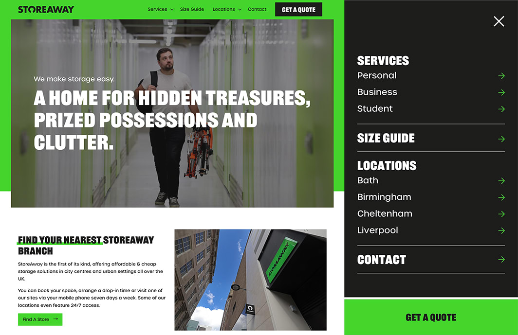
You will find all the links from the regular, non-mobile website on the mobile website. Mobile users, however, will find a sticky "Get a Quote" button at the bottom of the page. Desktop users will find it at the end of the menu.
It is likely that we will see small deviations in how major components, such as navigation, are designed as designers evaluate the data they have about user habits and goals for the different devices they use. Increasingly, websites will adopt app-like features in the future.
By transforming the mobile web experience, websites can offer different experiences to achieve website business goals.
Shape texturisation
Skeuomorphism brought a wide variety of real-world textures to the screens of our computers and mobile devices many years ago. The textured backgrounds quickly became perceived as extraneous and distracting, and so the design trend was abandoned.
Although one web design trend has fallen out of favour, digital texturisation remains relevant and looks to be gaining in popularity amongst designers. Organic and strategic textures can enhance designs. Adding visual interest to the user interface without overpowering it.
It is also possible to use digital texturisation in a strategic manner. It is a good example of how to draw a users attention to certain areas of your website.
Throughout the above one-page website, two shapes are used. You can direct your visitors' eyes to where you desire by maintaining consistency in texturisation.
It is common for the shapes to appear closer to the right margin of the page. These shapes should increase the amount of content that users see and interact with since their eyes tend to be drawn to the left margin of the screen.
Supplementary video
In terms of how they consume online content, users have a variety of preferences. People interested in reading something for a long time can benefit from blogs, for instance. In contrast, video posts provide an ideal experience for those who wish to watch or listen to the content.
It is unlikely and unpractical that audio-visual content can be produced for every piece of information required for websites. The design may quickly spiral out of control as you try to provide a personalised experience for content consumption. Furthermore, videos are often large files, and loading times will likely slow down as more of them are added.
Well-designed supplemental videos can provide users with options whilst keeping page loading to a minimum.
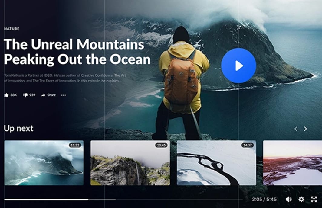
It is possible to use this video section for a variety of purposes. To showcase video testimonials. To summarise all the information presented previously. Providing an easy-to-follow explanation of the technical features of the product. So on and so forth.
It is unnecessary to take up a great deal of space for the supplemental video to be compelling. In the below example, the video is contained within a small cutout.
It is immediately obvious that there is something to watch (if that is what visitors wish to do). In addition, this content can be used for a variety of purposes.
Furthermore, designers can improve page loading speeds by using video sparingly and strategically instead of auto-playing video backgrounds and sections.
In conclusion
Website trends tend to be discussed in terms of colours, animations and superficial effects. We believe that over the next year, more attention will be paid to creating a better and more consistent experience for everyone. By creating better user experiences, it should be easier to deliver website goals, as more accessible interfaces have proven to create more engagement.